RB Solution
Contract furniture
Client:
RB Solution
Tag:
None
,
Identity
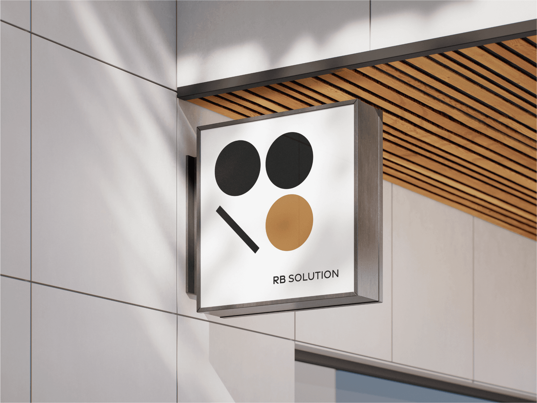
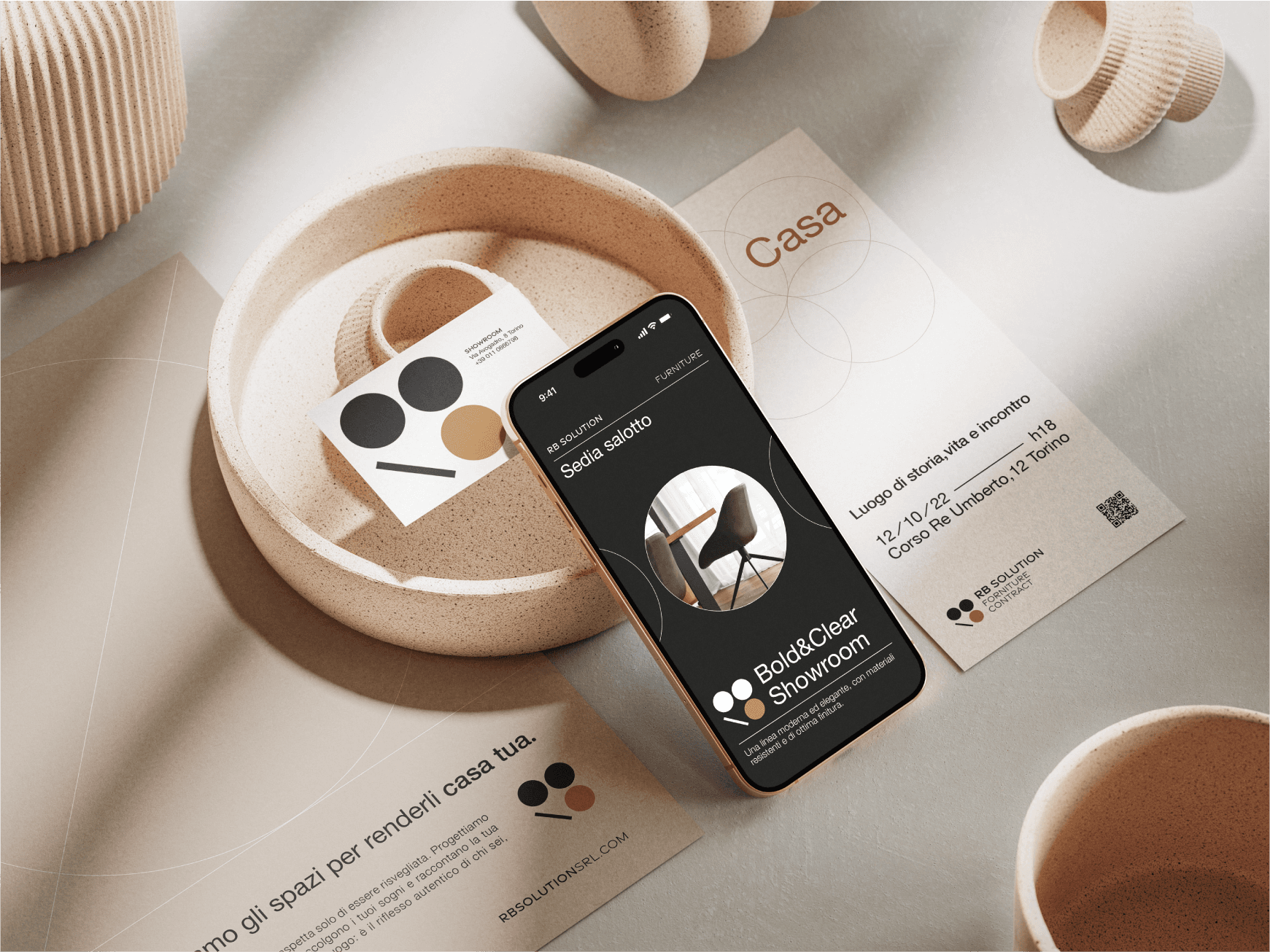
A brand that speaks the same language as the spaces it designs.
Project Description
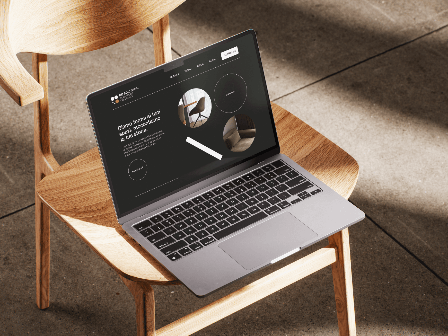
RB Solution is an architecture and space design studio that needed a visual identity equal to its vision: recognizable, distinctive and able to position the studio competitively within its sector.
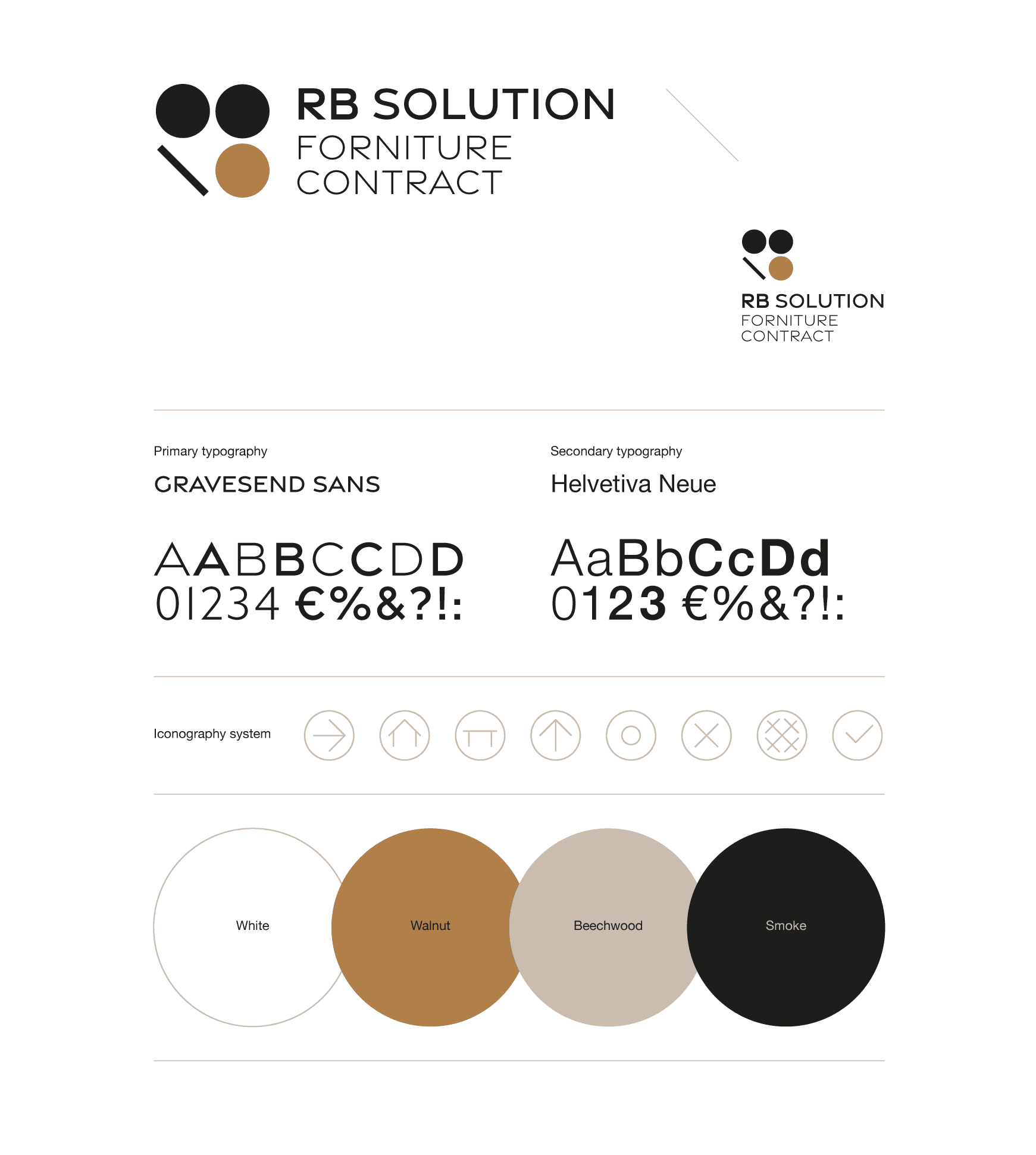
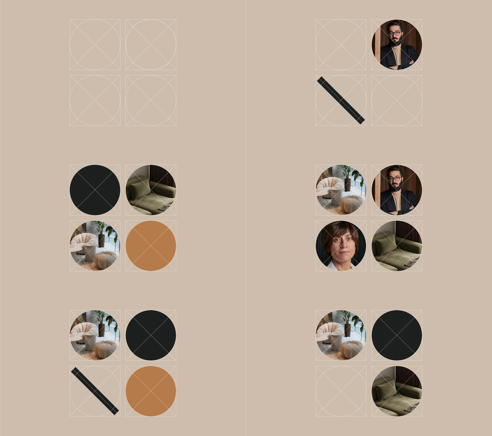
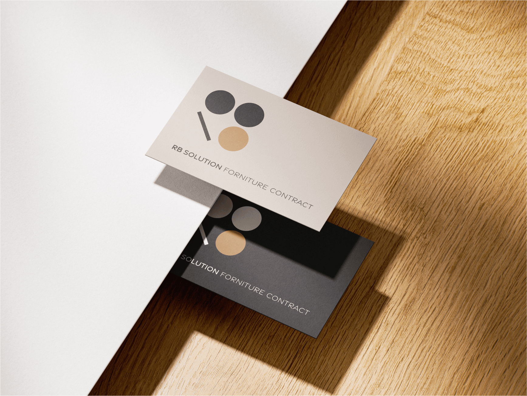
Essential geometry — the circle and the line — became the visual language best suited to evoke the modularity and structural logic of architectural space. Starting from these two elements, I rebuilt the letters “R” and “B”, designing a minimal, refined and elegant logotype.
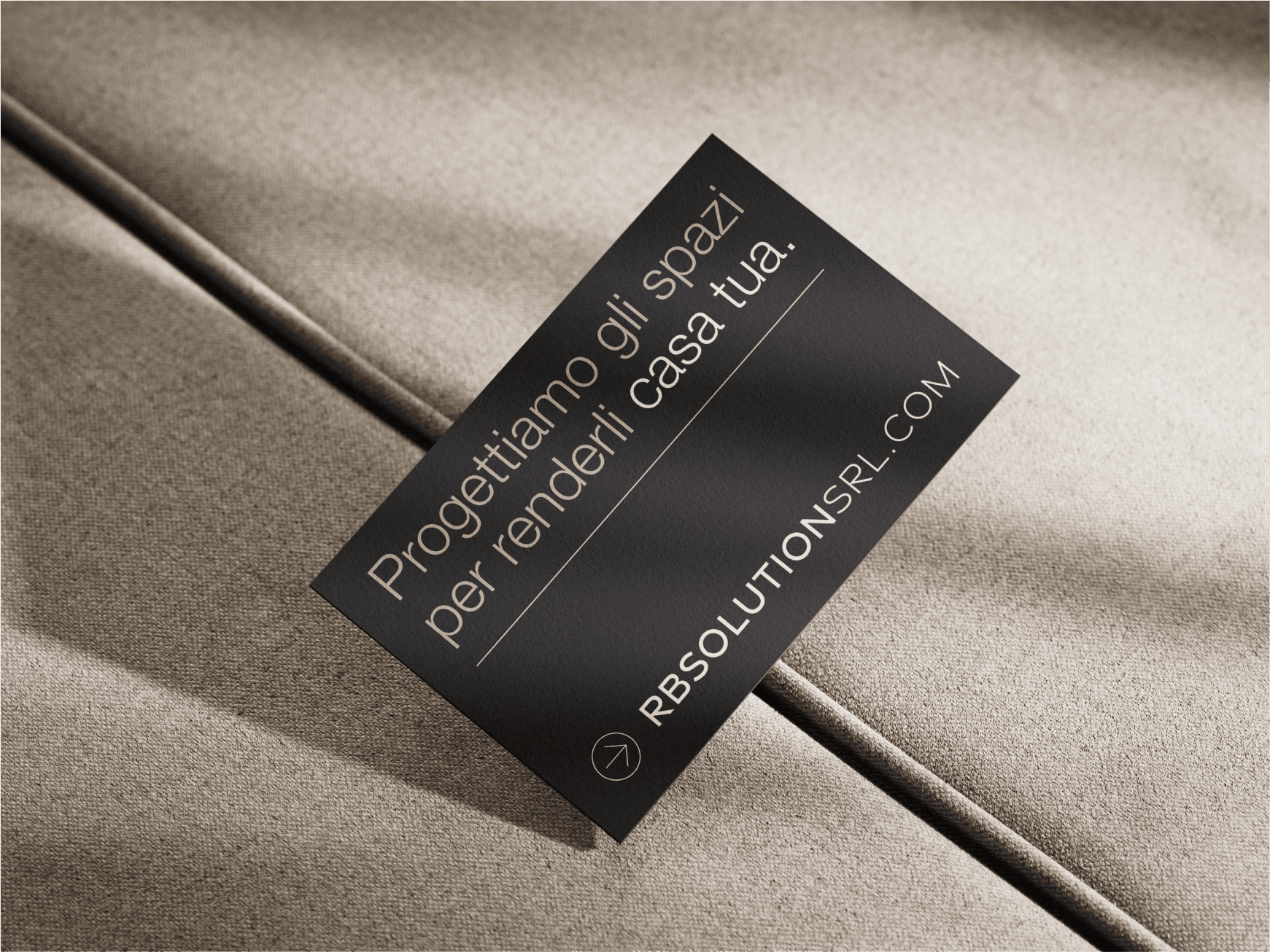
The identity is completed by a colour palette built on contrast: Walnut, Beechwood and Smoke. These evocatively named tones do more than recall the warmth of natural materials; they root the visual identity in the world of lived-in spaces. A balance between warmth and rigour that conveys solidity and character.
The visual system was completed with a set of custom icons, designed to remain coherent with the brand language and applicable with the same care in every communication context.
The result is an identity that communicates order, balance and clarity — RB Solution’s founding values — while also expressing the studio’s personality and vision.
Credits
Agency
:
Creostudios S.p.a.