Smile City
ETRA
Client:
Smile City
Tag:
Sustainability
,
Identity
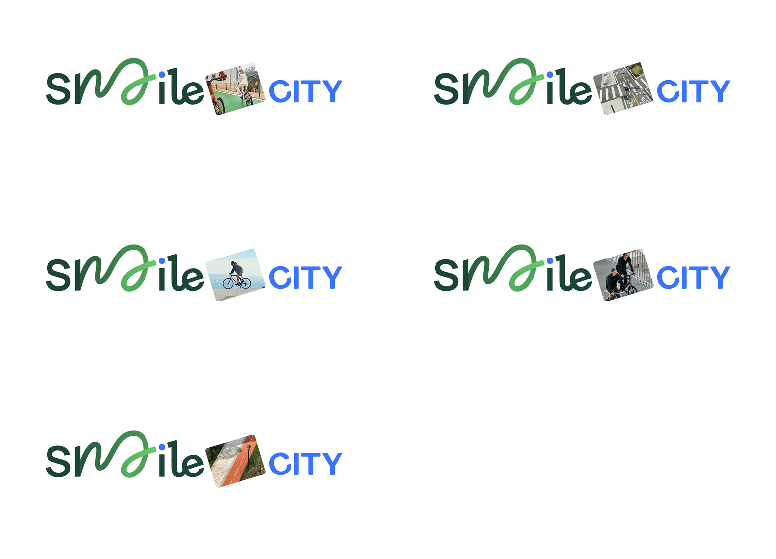


A letter that does not end where you expect it to: it turns, returns and begins again.


Project Description
Smile City — short for Sustainable Materials for Innovative, Low-Emission applications in the Circular City — is a European project dealing with complex themes: sustainable mobility, circular economy and material regeneration. When ETRA opened the creative competition for its visual identity, I was selected to translate all of this into a logo and communication system able to speak to a broad audience: citizens, participating companies and European-level stakeholders.
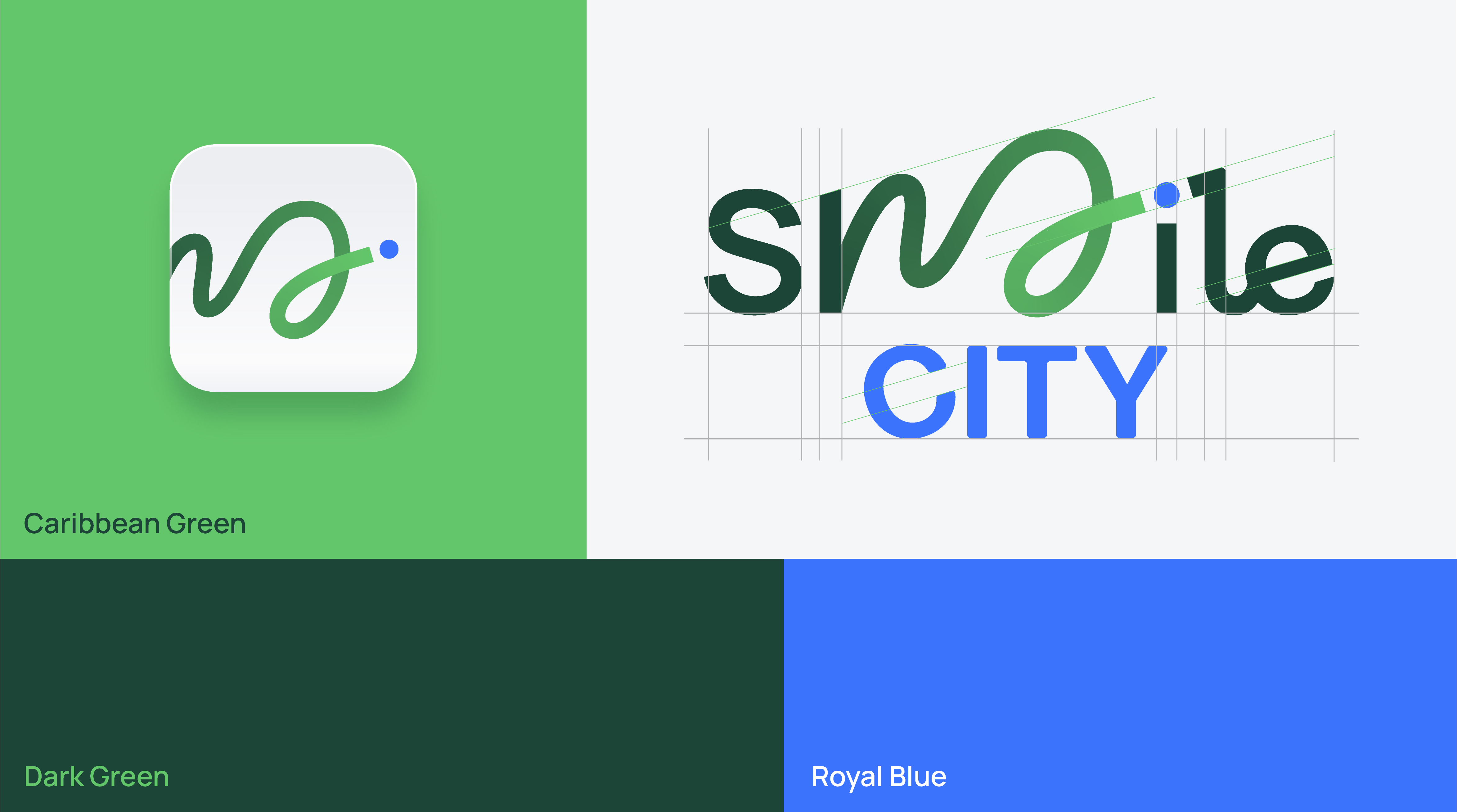
The heart of the project lies in one precise visual intuition. The stroke of the “M” is not only a letter: it becomes both a cycle lane and the path of recycled materials returning into circulation. A swirling trajectory that carries the idea of circular economy and makes it immediately readable, with no need for explanation.
The colour palette follows the same logic. Dark Green fades into a bright Caribbean Green, communicating the idea of change expanding outward. Royal Blue enters the composition as a balancing element and explicitly references the European context in which the project is rooted.
The identity was then applied across all project touchpoints: from the mobile app to outdoor communication and promotional materials. A coherent visual system designed to live as naturally on a smartphone screen as on a poster along a cycle lane.
Credits
: